Yay, it's been published now!
Thanks to all who tested and provided priceless feedback, including Tub, Twelvepack, Stickyman05, Raiscan, ShinyDoofy, Moozooh, Alden and Warp.
Total amount of site source code changed:
# 08:04 ArticleIndex (New +13) by Bisqwit · "New page (INCOMPLETE CONTENT, needs edit)"
# 08:04 NewMovies (Diff +1) by Bisqwit · "+tab"
# 08:03 GameList (Diff +1) by Bisqwit · "+tab"
# 08:03 ListAllMovies (Diff +0) by Bisqwit · "+tab"
# 08:03 SubmitMovie (Diff +1) by Bisqwit · "+tab"
# 08:02 SubmissionInstructions (Diff +1) by Bisqwit · "+tab"
. * 07:30 (Diff +0) by Bisqwit · "update submission-updating instructions"
# 08:02 About (New +41) by Bisqwit · "New page"
# 08:02 (homepage)Bisqwit (Diff +1) by Bisqwit · "+tab"
# 08:01 SiteTechnology (Diff +1) by Bisqwit · "+tab"
# 08:00 Movies (New +27) by Bisqwit · "Revised content"
# 08:00 FrontPage (Diff +1) by Bisqwit · "New front page layout"
# 07:57 SystemPages (Diff +1) by Bisqwit · "Revised content"
# 07:57 SystemLayoutMainMenu (New +6) by Bisqwit · "New system page"
# 07:56 SystemLayoutTinyMenu (New +4) by Bisqwit · "New system page"
The primary motivation behind this change is to bring the site layout style forward by a few years. Hopefully the usability was also improved a little in the process, and not degraded.
Blame /praise ahead :)
It looks very nice :). It's also nice that the latest submissions are also visible at the front page. It is a pity that the movies that were obsoleted by the new publications aren't listed anymore though. It made it both possible to see if the movie is an improvement, or a whole new run, and if it's an improvement by how much it was improved.
Joined: 4/20/2005
Posts: 2161
Location: Norrköping, Sweden
I like it. It will take me some time to get used to it, but overall I agree that it brings the style a few years forward.
And I noticed that we got a new slogan with "When human skills are just not enough". Sounds good!
I also noticed that there's a suscription page now. I'm not familiar with this feature, how does it work?
I like the 'exhibitions' and categories of stuff - looking forward to watching the skipped games.
I also like the purple.
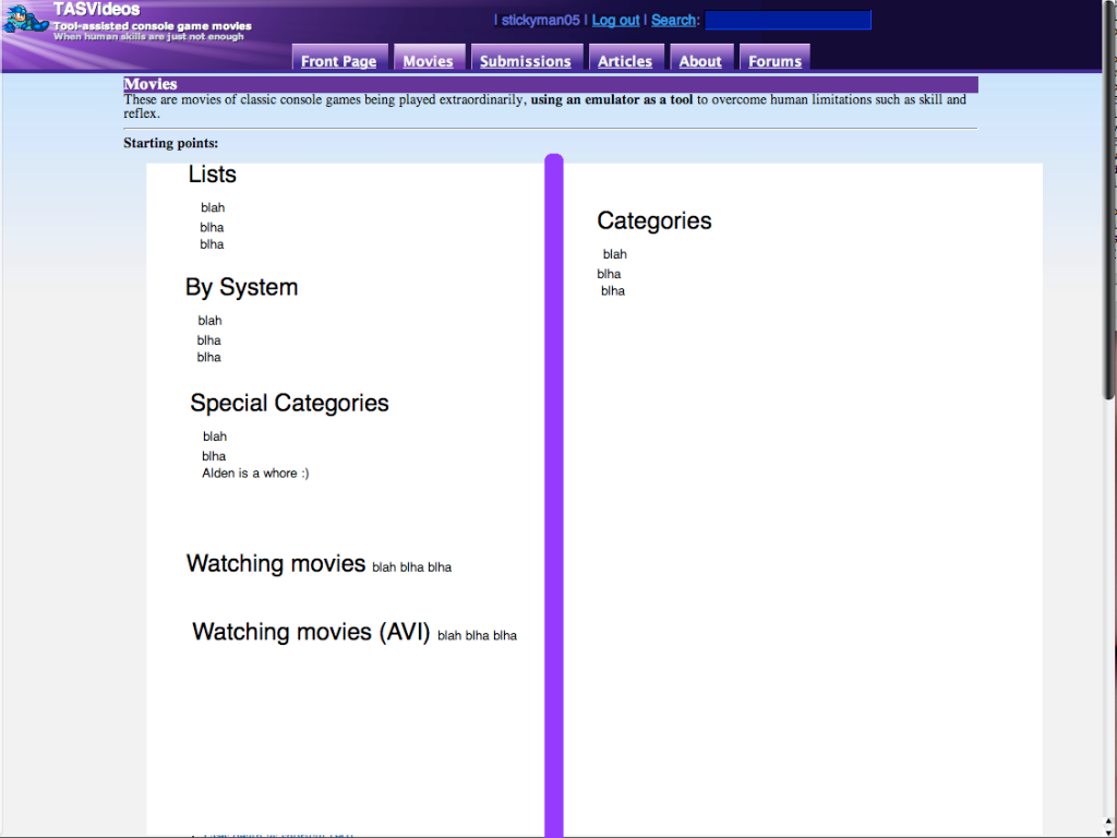
I think the right-side can look a little bare on the movies page though. An image there would be nice - maybe a collage of various consoles and stuff - something non-game-specific?
I'm just some random guy. Don't let my words get you riled - I have my opinions but they're only mine.
I think the right-side can look a little bare on the movies page though. An image there would be nice - maybe a collage of various consoles and stuff - something non-game-specific?
Now that you mention that, I agree. Perhaps, as opposed to more pictures, you could make two columns of links... kind of like this http://i158.photobucket.com/albums/t90/stickyman05/Picture1-2.png
The problem lies with having such a long list of movie categories... i think you are going to have massive blank space regardless. My idea would just minimize scrolling (i think).
Yes, i am using a very crappy version of paint, so you get to deal with the crappy looks of it. But, you get the idea.
As a minor nitpick, Bisqwit, under the movies by category in the movies tab, I noticed you have an extra black bullet.
adelikat wrote:
I very much agree with this post.
Bobmario511 wrote:
Forget party hats, Christmas tree hats all the way man.
On one hand, it's nice to see that the site finally gets an update.
...
On the other, I still have a lot of gripes about it. Some new, some old.
The upper-right corner menu is strange. It is more "center-right", making the upper balance of the page get thrown off. The problem isn't fixed in lower resolutions, either.
On some pages, tables look really bad.
On the main page (and many others), the headers seem to blend into normal text. Even stranger, the main headers aren't centered, and are actually far smaller than the next level. It looks strange as a page heading. (The lack of a padding or border makes it look a bit weird too)
The font feels way too small, especially with the table of contents and the main text in general. That and I really don't like serif fonts.
There's still no method of seperating movie lists into pages. Movies/NES becomes huge:
Size of main page:                520,037b
Number of inline elements: 240    857,473b
That's almost 1.5MB for the list. Splitting this into an alphabetical order (say, 20-50movies per page, seperated into A-E, F-G, etc) would work best. The ranges could be tweaked automatically to create splits at the edges of letters, while keeping movie counts roughtly balanced.
Also, I hate serif fonts.
The lack of header fanfare on main page makes it difficult to see the splits in content. Especially with the sea of underlined links (perhaps you should remove the underlining in that area, as the blue text is more than adequate?). Maybe removing redundant data for movie dates by using tables, too.
Titles of pages should probably be reformatted into "Page Name - TASVideos". Otherwise you end up with a browser window that looks like this:
[TASVide...][TASVide...][TASVide...][TASVide...][TASVide...]
I speak from experience when I say that I changed the order (page then site) and a lot of people suddenly realized that they could make out what a tab was, especially if they have multiple ones open.
Things like the submissions list could use Javascript for easier sorting, especially since the content usually isn't that long and it'd save a bit on server stress. It also would have the handy bonus of not giving me AccessBlocked messages!
Submission pages themselves need to be overhauled. The information feels like it was randomly squished about the page to try to make up for the lack of a standard footer, and mostly feels rushed and crushed together. One advantage of changing the format would be losing the giant table disaster:
Game information
ROM name, game name and version...
Author's information.
Author's nickname and/or realname. (Other movies by this author)
Submitter, only if it is different from the author (which in 99.99% of cases, it isn't -- if you exclude team TASes, at least)
Movie information
Rerecords, length.
Interaction
Movie's status. Link to publication if it exists.
Download movie.
Discuss and rate movie.
Submission text
It goes here.
Related pages.
The "last edit", "pages that refer to this submission", etc. should be left on the global footer. Yes, that means reapplying it here. (It's conspicuously absent, and would allow people to view the page history without creatively rewriting pages.)
...
Feel free to start bitching and whining about how I'm being a jerk and how this is brand new and how it's completely wrong to make any negative comments on it and so on and so forth ad nauseam. I don't care. It's my opinion, deal with it.
Joined: 3/10/2004
Posts: 7698
Location: 🇫🇮 Finland
I like to keep an up-to-date collection of all the movies. I do this by deleting the obsoleted ones before I download the movie that obsoletes an older one.
I usually do this by looking if the current new video obsoletes an older one, and then try to guess by the name of the game and the author of the run the name of the avi file. Sometimes this task has been a bit difficult eg. if the obsoleting movie drastically changes its file name from the movie which it obsoletes. Then I have to perform more research to find out what exactly was the file name of the obsoleted video (a task which is made harder by the fact that movie pages for obsoleted videos don't show the name of the file).
It would be nice if rather than making this task even harder than it already was, it was made easier: How hard would it be for the movie page for a given movie to explicitly tell which movie it is obsoleting (including the exact file name of the obsoleted movie)? This way I wouldn't have to keep guessing the file names.
Joined: 10/27/2004
Posts: 1978
Location: Making an escape
The Ferret's opinion:
I like the look and the color scheme. Very slick and eye pleasing.
However, there's just something about the layout that isn't sitting well with me, and for the life of me I can't put my finger on it. I guess part of it is that I like having sidebars of some kind, and this doesn't have any to speak of. Probably because, in my mind, things that control everything should be next to everything instead of above it.
I don't know; I have an extremely hard time putting thoughts into words. If push comes to shove, I'll just get used to it.
A hundred years from now, they will gaze upon my work and marvel at my skills but never know my name. And that will be good enough for me.
It would be nice if rather than making this task even harder than it already was, it was made easier: How hard would it be for the movie page for a given movie to explicitly tell which movie it is obsoleting (including the exact file name of the obsoleted movie)? This way I wouldn't have to keep guessing the file names.
That would be pointless for most people. Nobody cares about filenames except you.
In fact, I give you something that will make your job easier: Prefix every movie with "0000-moviename", where 0000 is the movie ID. Then you won't have to "guess" about anything.
I like it. It will take me some time to get used to it, but overall I agree that it brings the style a few years forward.
And I noticed that we got a new slogan with "When human skills are just not enough". Sounds good!
I also noticed that there's a suscription page now. I'm not familiar with this feature, how does it work?
This feature, called an RSS feed, has actually been around for a while, but it's been kinda hidden. You will need an RSS reader to get the updates provided by this feed. Internet Explorer 7 includes a feed reader and there should be at least one Firefox extension as a RSS feed reader. If you use some kind of desktop gadgets, there is bound to be an RSS feeder gadget for that program. There are also standalone readers and Google Reader. Just search around and find the best application for your use.
<ccfreak2k> There is no 'ctrl' button on DeHackEd's computer. DeHackEd is always in control.
RSS feeds basically are ways to get updates without having to visit the site in question. So for example, you could subscribe to all of the feeds for all of the sites you are interested in, go to your feed aggregation page, and see all of the updates for all of those sites in one place.
Pyrel - an open-source rewrite of the Angband roguelike game in Python.
Just to point something out, the search button makes it look like the top right text box beside it is for searching when it is for passwords?
It is indeed for searching.
The password is input to the field that comes after the "Password:" prompt when you first input your Login name.
Re: serif fonts: I like them ;) Though I don't like Times new Roman that much, especially the hinted (pixel-aligned) one. I set the body text font to Georgia IIRC.
Xkeeper: The main header size… well, I wanted to prevent it taking too much room, as it is rarely the most relevant piece of the page; you already should know which page you entered, and the first paragraph should tell a lot more than that header.
Re: Movies pages sizes: That is why I have wanted to tone the movie listing pages to the direction that I used on the Aural version, and only display the full information on pages that have a single movie on each. Unfortunately, that idea was not very welcomed.
stickyman05: Columns are difficult to layout in HTML, unless you resort to using tables. However, as for tables, the current Wiki markup doesn't quite support them to the extent you suggested, so unless one wants to hardcode that page as serverside code, it is a no-go. (The extra bullet is also a consequence of this design.) An option is to switch to another wikimarkup engine, which is what I studied in e.g. September. However, I fear I do not have time for that project; new developers are needed.
I really like the new site layout, congrats!
The only problem I can see is that there is no longer a "Rate" link on the front page while you're logged in.
Despite this, I believe that the new layout is definitely a major improvement. ^_^
Re: serif fonts: I like them ;) Though I don't like Times new Roman that much, especially the hinted (pixel-aligned) one. I set the body text font to Georgia IIRC.
Xkeeper: The main header size… well, I wanted to prevent it taking too much room, as it is rarely the most relevant piece of the page; you already should know which page you entered, and the first paragraph should tell a lot more than that header.
Yes, but it looks very awkward as it is.
Re: Movies pages sizes: That is why I have wanted to tone the movie listing pages to the direction that I used on the Aural version, and only display the full information on pages that have a single movie on each. Unfortunately, that idea was not very welcomed.
Details should still be given, even for abbreviated movies. Otherwise you actually have click though to many other pages to find what you're looking for. Splitting them into groups would make more sense; smaller page sizes, while still displaying all movie information.
I like the return of the Recommended movies.
Though it would be kind of nice to have the stars all be links to "Recommended Movies" page.
I dunno, just a random thought.
That would be pointless for most people. Nobody cares about filenames except you.
In fact, I give you something that will make your job easier: Prefix every movie with "0000-moviename", where 0000 is the movie ID. Then you won't have to "guess" about anything.
I care too. I have exactly the same problem.
And if the filenames are changed, they can no longer be seeded. That's half the reason I keep them.
Bisqwit wrote:
stickyman05: Columns are difficult to layout in HTML, unless you resort to using tables. However, as for tables, the current Wiki markup doesn't quite support them to the extent you suggested, so unless one wants to hardcode that page as serverside code, it is a no-go. (The extra bullet is also a consequence of this design.) An option is to switch to another wikimarkup engine, which is what I studied in e.g. September. However, I fear I do not have time for that project; new developers are needed.
Does that also mean that putting an image on the right-hand side is a headache?
What if the picture were a background gif or png, with a transparent left side?
I'm just some random guy. Don't let my words get you riled - I have my opinions but they're only mine.


