Former player
Joined: 10/6/2007
Posts: 330
Location: B.C Canada
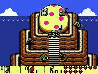
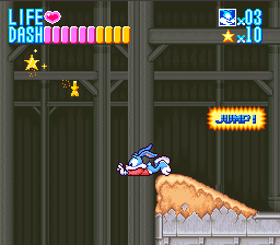
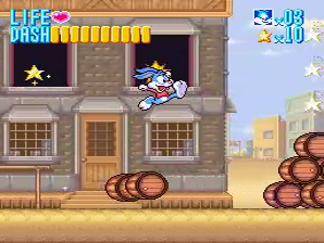
Um... I'm not intending to sound rude or anything, but for link's awakening DX, Isn't this is most obvious choice? I also think the Buster Busts loose image is no good. Here is the current image Considering this is a colourful game, this image does not show it very well. I think something like this might be better. Though another thing is that the player abuses an error that basically makes him fly, (which I found annoying since that game is normally insanely hard) so an image showing that might be good. Like this. [/img]
Experienced player (828)
Joined: 11/18/2006
Posts: 2426
Location: Back where I belong
I actually really like the image that already exists for Buster Busts Loose. While it's not the most colorful action shot, seeing that "Jump!" warning when he's stretched out with only his toes connecting him to the ground is pretty funny. It's actually one of those screen shots that makes me usually smile when I see it.
Living Well Is The Best Revenge My Personal Page
JXQ
Experienced player (761)
Joined: 5/6/2005
Posts: 3132
I've gone through the initial list and most of the 2nd wave of suggestions. Please let me know if I've made any horrible decisions. See the first post for recently updated screenshots. (There are still a few runs that have their predecessor's screenshot. In most cases they are runs done on Famtasia, very very similar to the previous run, or in the process of being improved anyway.)
<Swordless> Go hug a tree, you vegetarian (I bet you really are one)
Joined: 8/13/2005
Posts: 356
Location: Canada
Nice work, JXQ. I really like most of those choices. So the work on this subject is pretty much done for now?
Emulator Coder, Site Developer, Former player
Joined: 11/6/2004
Posts: 833
I still have the lossless AVI from 007. If you wanted to select a better screen shot, just give me a time from the published AVI and I'll slice it out. From your edit comment, it sounds like this wasn't your first choice.
JXQ
Experienced player (761)
Joined: 5/6/2005
Posts: 3132
FreshFeeling wrote:
Nice work, JXQ. I really like most of those choices. So the work on this subject is pretty much done for now?
Thanks! The big revamp is mostly done, but this thread is still a good place to comment on any screenshot, and I'll try to make a conscious effort at keeping new publications from not having a unique screenshot.
DeHackEd wrote:
I still have the lossless AVI from 007. If you wanted to select a better screen shot, just give me a time from the published AVI and I'll slice it out. From your edit comment, it sounds like this wasn't your first choice.
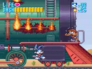
My first choice was this screenshot from the Streets, but as you will notice probably much sooner than I did, the sky is affected by emulation problems. My other idea was to see what was available from the Control level, which is why the desync in my edit got the annoyance level that it did out of me. Overall I'm happy with the one from the Train, except that it's a bit "cramped" feeling. I'm definitely open to suggestions, though, if others don't like that one.
<Swordless> Go hug a tree, you vegetarian (I bet you really are one)
Skilled player (1410)
Joined: 5/31/2004
Posts: 1821
Not really sure if it was mentioned already (didn't see it), but Legend of Zelda, Second quest has a screenshot from a first quest TAS.
Editor, Emulator Coder, Expert player (2156)
Joined: 5/22/2007
Posts: 1134
Location: Glitchvania
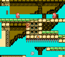
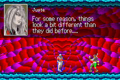
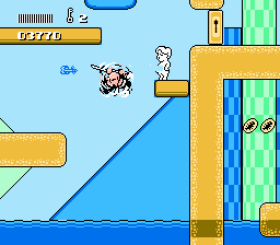
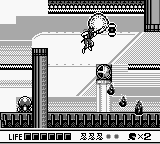
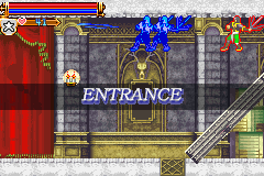
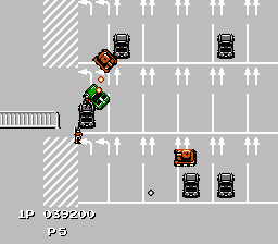
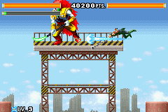
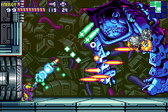
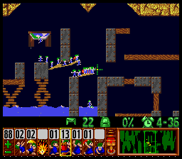
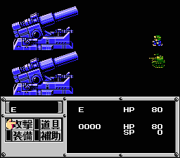
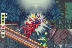
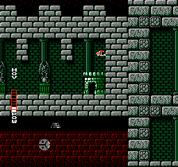
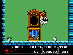
Little Samson: I updated the screenshot because the old screenshot was carried from the obsoleted movie, and it showed something only happened in the previous movie. New: Castlevania: Harmony of Dissonance: I might have updated the screenshot too soon, but I think my suggested screenshot is much better. New: Kid Niki 3: This game sometimes manages to censor "harmful material". New: Ninja Gaiden Shadow: I replaced the old dim screenshot with a bright one. New: "Maxim Version" Castlevania: Harmony of Dissonance: New: "1 player" Jackal: GTA isn't the original. New: Ninja Five-0 (obsolete): This isn't necessarily the best screenshot, but it is better than the old one. New: "100%" Metroid Fusion: I just used one of the two screenshots suggested by P.JBoy in this thread. New: Lemmings: A more colourful screenshot: Metal Max: The author demanded it: Megaman Zero 4: Light green and red didn't look good. New with the historical background: Blaster Master: New: http://tasvideos.org/1344M.html: The old one had bad composition. New:
<klmz> it reminds me of that people used to keep quoting adelikat's IRC statements in the old good days <adelikat> no doubt <adelikat> klmz, they still do