Post subject: the new front page
Tub
Joined: 6/25/2005
Posts: 1377
Hi, is it just me or is the new frontpage totally overloaded? I understand the desire to have everything "important" available there, but that leads to cluttering and isn't newbie-friendly at all. For extreme cases of minimalistic design, see http://www.openoffice.org/ or http://www.winehq.org/ - the only purpose of their front pages is to lead the visitor in the right direction. That approach may increase the amount of clicks required to get somewhere, but it will make finding those clicks a lot easier. For tasvideos, we probably should find a middle-ground between something easy and newbie-friendly and something powerful enough for the regulars. So here's some ideas and suggestions for the front page. 
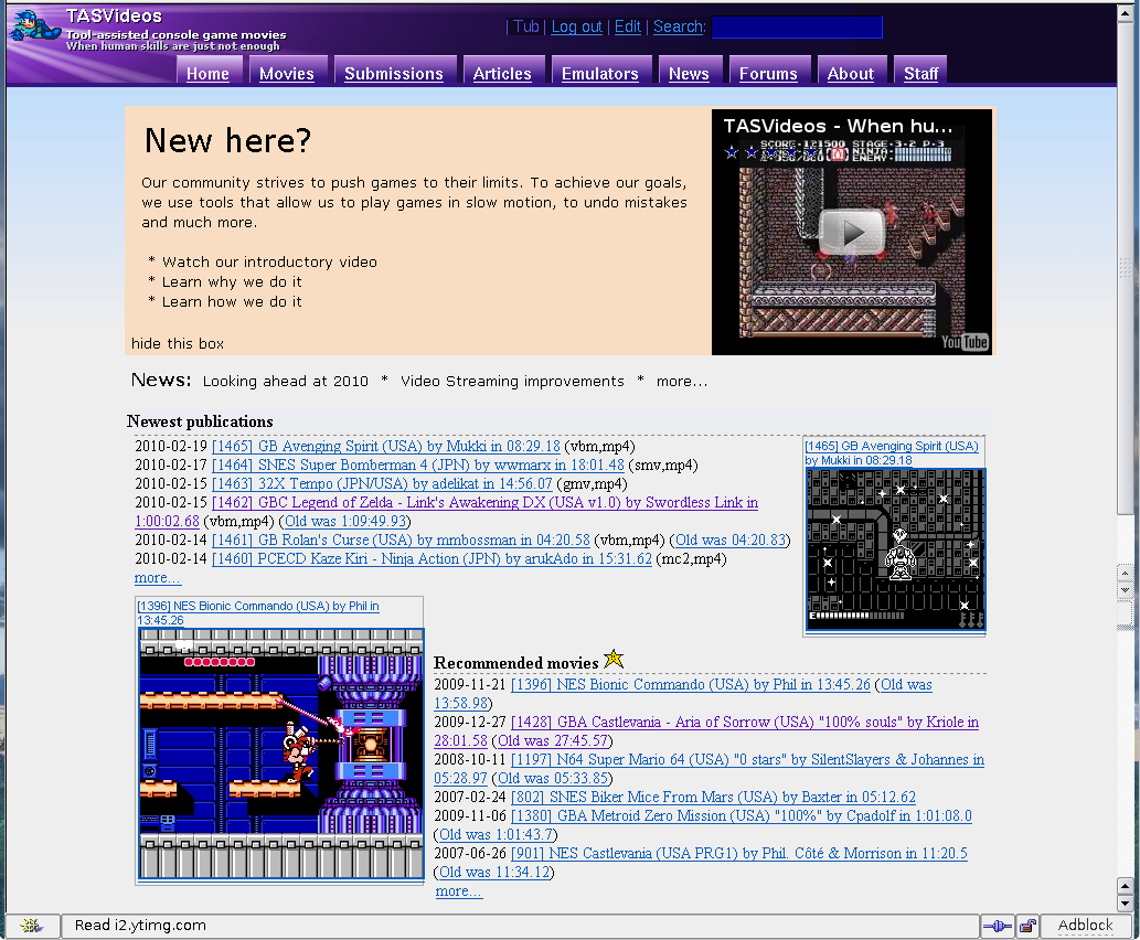
mockup image. Explanations follow: The "Newbie-Box":
  • If you're new, you need good visual guidance. While the colour could be improved, a seperate "newbie-box" with good visibility will help
  • regulars should be able to hide said box, setting a permanent cookie or something. Or just hide the box for logged-in users. Or both.
  • Get rid of all the text, tl;dr and stuff. Explanations how to view the videos are hardly front-page material, that can be explained on the movie pages. There should be a *short* introduction followed by a few useful links. Which links exactly we want to add can be argued about; I just added three non-perfect examples. We might also want to link our game resources and/or the contribute page.
  • there's currently a tiny, barely visible youtube-video embedded on the right, displaying half a headline and a random frame. Replace it with a proper (and inviting) screenshot and do some javascript-magic to open the video inside a larger <div> like longplays.net used to do before the current drama.
News:
  • I think it's enough to display the headlines with links. While it's good to have news on the front-page, they really shouldn't take up the majority of the space.
  • The newsticker needs some visual identification, it's way ugly in my mockup.
Movies:
  • Movies are the bread and butter of this site. They should have a prominent role on the front page. Suggesting revert to previous size.
  • recommended movies: remove the obsoletion info ("Old was: 12:34:56"), it's only useful for recent publications. That will avoid some line-breaks when a larger screenshot is displayed.
  • my mockup tried to interleave the new and recommended movies for better space usage with larger screenshots. I'm not sure that's a good idea, but I'll just keep it there for consideration.
discuss.
m00
Joined: 10/20/2006
Posts: 1248
Some suggestions: Insert a big headline that says something like "Welcome to TASVideos" above where it says "TASVideos is a community for creating and publishing Tool-Assisted Speedrun (TAS) videos of classic and modern video games." now. The TASVideos news thing should definitely stay, imo. Change "Most recent additions: 2010-02-19 [1465] GB Avenging Spirit (USA) by Mukki in 08:29.18 (vbm,mp4)" To "Most recent additions: 2010-02-19: GB Avenging Spirit (USA) by Mukki in 08:29.18" (Why would users care for the run's unique number and the format it was endoded in at this point?) Remove (Old was ....) and the submission date everywhere except for at the most recent additions. They are really not necessary here. For recommended movies, divide them in categories. Then make up a symbol for any of these categories. Display them randomly, as now, but with the category symbol in front of them. The symbol should give the viewer an idea of why this movie is recommended to be watched. (f.e. the run looks particularly speedy, has a very high technical level, is very glitchy, is very hilarious, etc) One run could fit into several categories. A legend explaining these symbols would have to be displayed somewhere. The point "Newest submissions" needs to be explained. Newbies won't just know that we actually have a voting process going on they can participate in. What's the difference between movies an submissions? Right now, this point is just confusing.
Sir_VG
He/Him
Player (39)
Joined: 10/9/2004
Posts: 1911
Location: Floating Tower
I agree that recent publications should go back to the original size. The scrunched layout is hard to read. It's partially due to the font, IMO.
Taking over the world, one game at a time. Currently TASing: Nothing
Emulator Coder
Joined: 3/9/2004
Posts: 4588
Location: In his lab studying psychology to find new ways to torture TASers and forumers
Sir VG wrote:
I agree that recent publications should go back to the original size.
Original? How original do you want? This was in use till the end of 2008: http://tasvideos.org/wiki.exe?page=FrontPage&rev=87
Warning: Opinions expressed by Nach or others in this post do not necessarily reflect the views, opinions, or position of Nach himself on the matter(s) being discussed therein.
Joined: 8/13/2005
Posts: 356
Location: Canada
Kuwaga wrote:
For recommended movies, divide them in categories. Then make up a symbol for any of these categories. Display them randomly, as now, but with the category symbol in front of them. The symbol should give the viewer an idea of why this movie is recommended to be watched. (f.e. the run looks particularly speedy, has a very high technical level, is very glitchy, is very hilarious, etc) One run could fit into several categories. A legend explaining these symbols would have to be displayed somewhere.
I like this idea very much. Even the award images could be used, although they may be too big and they wouldn't suffice to describe all of the recommended movies. I also like the news on the main page but would prefer just the headlines.
Sir_VG
He/Him
Player (39)
Joined: 10/9/2004
Posts: 1911
Location: Floating Tower
Nach wrote:
Sir VG wrote:
I agree that recent publications should go back to the original size.
Original? How original do you want? This was in use till the end of 2008: http://tasvideos.org/wiki.exe?page=FrontPage&rev=87
The way it is now, with new releases, recommended, and new submissions being the same size. I guess the term I wanted was "the way it was before". But uh...yeah.
Taking over the world, one game at a time. Currently TASing: Nothing
Emulator Coder
Joined: 3/9/2004
Posts: 4588
Location: In his lab studying psychology to find new ways to torture TASers and forumers
Sir VG wrote:
I guess the term I wanted was "the way it was before". But uh...yeah.
Before what though? It's not like we invented a new look in the past few days, we're just blending old ideas.
Warning: Opinions expressed by Nach or others in this post do not necessarily reflect the views, opinions, or position of Nach himself on the matter(s) being discussed therein.
Skilled player (1402)
Joined: 5/31/2004
Posts: 1821
I really like the what was "NewMovies" page, which is now names the "MoviePublishingHistory" page. It has a great layout, displaying clearly when the TAS was made, what it obsoletes and the author. I would be a big advocate for having the same layout (obviously with only the movie it just the old version it obsoleted) at the front page. The only downside might be that it costs a bit more space, but I think it well worth it. Far more important however I think is changing that the link "more..." back to the what is now "MoviePublishingHistory" page. The current "NewMovies" page has the same 'not so nice' layout as the front page. The full history page is such a great page, and it's really hard to find it when one doesn't know about it. (I would change this (back) myself, but it seems like someone put some thought into it.)
P.JBoy
Any
Editor
Joined: 3/25/2006
Posts: 850
Location: stuck in Pandora's box HELLPP!!!
I would really like the page to be customisable, I'm a rather light-content on dark-background kinda guy; I assume customisations can be kept in a cookie. Worrying about newcomers only would be our concern then. There's also what I discussed with adelikat on IRC once about adjusting the movie list into columns, here's what I thrown together in MSWord: original vs. this
adelikat
He/Him
Emulator Coder, Site Developer, Site Owner, Expert player (3598)
Joined: 11/3/2004
Posts: 4738
Location: Tennessee
And I highly agree with your suggestion. Making it happen is very not trivial with the site code though :/
It's hard to look this good. My TAS projects
Emulator Coder
Joined: 3/9/2004
Posts: 4588
Location: In his lab studying psychology to find new ways to torture TASers and forumers
Baxter wrote:
Far more important however I think is changing that the link "more..." back to the what is now "MoviePublishingHistory" page. The current "NewMovies" page has the same 'not so nice' layout as the front page. The full history page is such a great page, and it's really hard to find it when one doesn't know about it. (I would change this (back) myself, but it seems like someone put some thought into it.)
The new setup is important. Most people don't want to see movies all the way back to 2004. Having to retrieve all that when you only want recent changes just costs server resources which we don't have. If all you care about is the layout, that's a different story, but it's important to not just show all the information imaginable just for the sake of showing something a bit prettier.
Warning: Opinions expressed by Nach or others in this post do not necessarily reflect the views, opinions, or position of Nach himself on the matter(s) being discussed therein.
Joined: 11/4/2007
Posts: 1772
Location: Australia, Victoria
You know what this sort of reminds me of. The transition of YouTube channels from the old layout to the new layout, so I've only got one suggestion. Is there a way to perhaps make the type of layout selectable via the account preferences?
Emulator Coder
Joined: 3/9/2004
Posts: 4588
Location: In his lab studying psychology to find new ways to torture TASers and forumers
P.JBoy wrote:
original vs. this
That looks nice, however, it would wreak havoc with double and triple obsoletions.
Warning: Opinions expressed by Nach or others in this post do not necessarily reflect the views, opinions, or position of Nach himself on the matter(s) being discussed therein.
adelikat
He/Him
Emulator Coder, Site Developer, Site Owner, Expert player (3598)
Joined: 11/3/2004
Posts: 4738
Location: Tennessee
And that happens soooo often we should totally be concerned.
It's hard to look this good. My TAS projects
Emulator Coder
Joined: 3/9/2004
Posts: 4588
Location: In his lab studying psychology to find new ways to torture TASers and forumers
Flygon wrote:
Is there a way to perhaps make the type of layout selectable via the account preferences?
Even if that were possible, we need the best possible front page for a new guy, the guy who isn't logged in. Perhaps we should even consider having two front pages. Logged in users don't need to see the junk on top, while non logged in users may be a bit overwhelmed by everything we have there.
Warning: Opinions expressed by Nach or others in this post do not necessarily reflect the views, opinions, or position of Nach himself on the matter(s) being discussed therein.
sgrunt
He/Him
Emulator Coder, Former player
Joined: 10/28/2007
Posts: 1360
Location: The dark horror in the back of your mind
Nach wrote:
Perhaps we should even consider having two front pages. Logged in users don't need to see the junk on top, while non logged in users may be a bit overwhelmed by everything we have there.
We could have the opening blurb only display if a user isn't logged in (I know the site has the capability to do this).
Emulator Coder
Joined: 3/9/2004
Posts: 4588
Location: In his lab studying psychology to find new ways to torture TASers and forumers
adelikat wrote:
And that happens soooo often we should totally be concerned.
I write code considering all possibilities, and what may break or be hacked through, not just the most common cases. You'd rather have an idiot who doesn't consider the consequences of code changes writing code for the site?
Warning: Opinions expressed by Nach or others in this post do not necessarily reflect the views, opinions, or position of Nach himself on the matter(s) being discussed therein.
P.JBoy
Any
Editor
Joined: 3/25/2006
Posts: 850
Location: stuck in Pandora's box HELLPP!!!
Nach is right, how about a striked through version of the obsoleted runs indented below the obsoleting run
sgrunt
He/Him
Emulator Coder, Former player
Joined: 10/28/2007
Posts: 1360
Location: The dark horror in the back of your mind
As of a few moments ago, the opening blurb is gone; if a user is not logged in a message directing them to the "Welcome To TASVideos" page (also recently created as an amalgamation of the front blurb, the about page, and a few bits and pieces of WhyAndHow). The rest of the layout is not something I dealt with in doing so, so we can continue to argue about it...
Banned User, Former player
Joined: 3/10/2004
Posts: 7698
Location: Finland
P.JBoy wrote:
this
I like that idea, but I wonder how difficult it would be to implement. If, however, the technical problems are solved and nice modular solution is implemented to list movies in that kind of format, maybe it could be used more widely throughout the site rather than just on the front page... (although that might require significant refactoring of other code as well, so it might not happen).
Former player
Joined: 11/13/2005
Posts: 1587
Here's my suggestion for the front page. The bottom two sections are not necessary. Newbie links section should probably have links to Why&How, recommended movies and some other because-you're-a-new-user-you-should-probably-read-these-pages.
P.JBoy
Any
Editor
Joined: 3/25/2006
Posts: 850
Location: stuck in Pandora's box HELLPP!!!
Warp wrote:
I wonder how difficult it would be to implement.
If it helps at all, that was done by making a table with no borders
Banned User, Former player
Joined: 3/10/2004
Posts: 7698
Location: Finland
Guybrush wrote:
Here's my suggestion for the front page.
Yeah, using that exact font too... :P
Former player
Joined: 11/13/2005
Posts: 1587
Warp wrote:
Guybrush wrote:
Here's my suggestion for the front page.
Yeah, using that exact font too... :P
I was actually serious with my suggestion.
Emulator Coder
Joined: 3/9/2004
Posts: 4588
Location: In his lab studying psychology to find new ways to torture TASers and forumers
Guybrush wrote:
Warp wrote:
Guybrush wrote:
Here's my suggestion for the front page.
Yeah, using that exact font too... :P
I was actually serious with my suggestion.
So was he.
Warning: Opinions expressed by Nach or others in this post do not necessarily reflect the views, opinions, or position of Nach himself on the matter(s) being discussed therein.